Typography
Choosing the Right Font: A Practical Typography Guide
How to pick the right typeface for a brand, an interface or print. A practical guide to font licences, legibility, pairing and language support.
Font choice looks like a matter of taste, but it is mostly a technical decision. The wrong typeface makes text hard to read, flattens a brand's tone and can create legal problems. This guide walks through the questions worth asking before you choose.
Start with the job, not the look
A typeface cannot be judged as good or bad on its own; it can only be judged as suitable or unsuitable for a specific job. So the first question is where it will be used.
- Headlines and logos: display or serif faces with distinctive character
- Long-form text: faces with a tall x-height and open spacing
- Interfaces: sans serifs that stay crisp at small sizes with clear numerals
- Packaging and signage: faces with strong heavy weights that read from a distance
No single family does all of these equally well, and it should not be expected to.
x-height is the strongest legibility signal
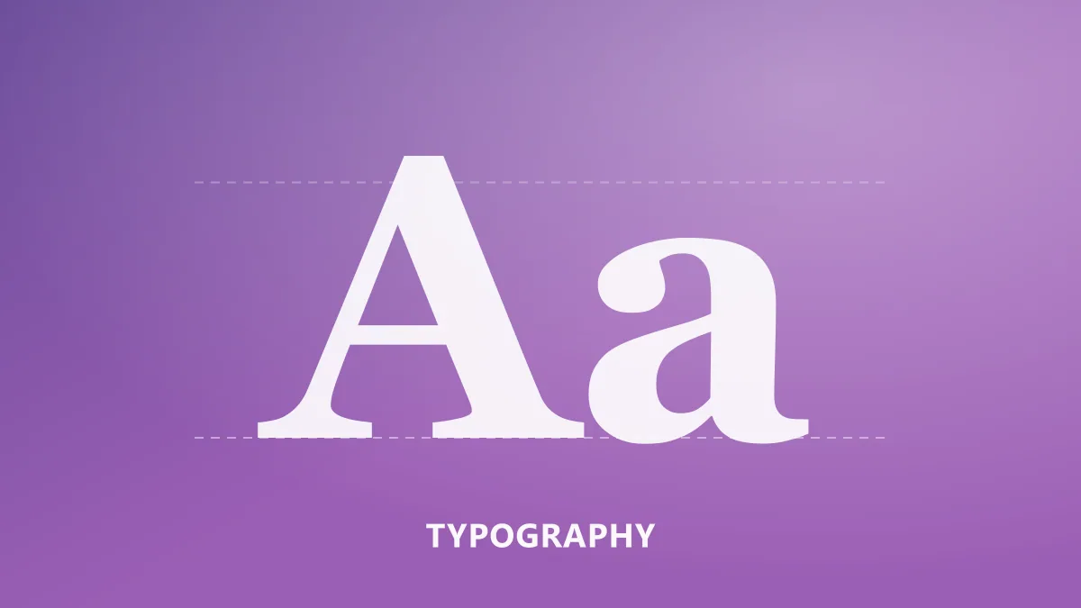
The x-height is the height of the lowercase body. At the same point size, a face with a tall x-height looks larger and reads more comfortably at small sizes. For interface and mobile work, this one property decides half the choice.
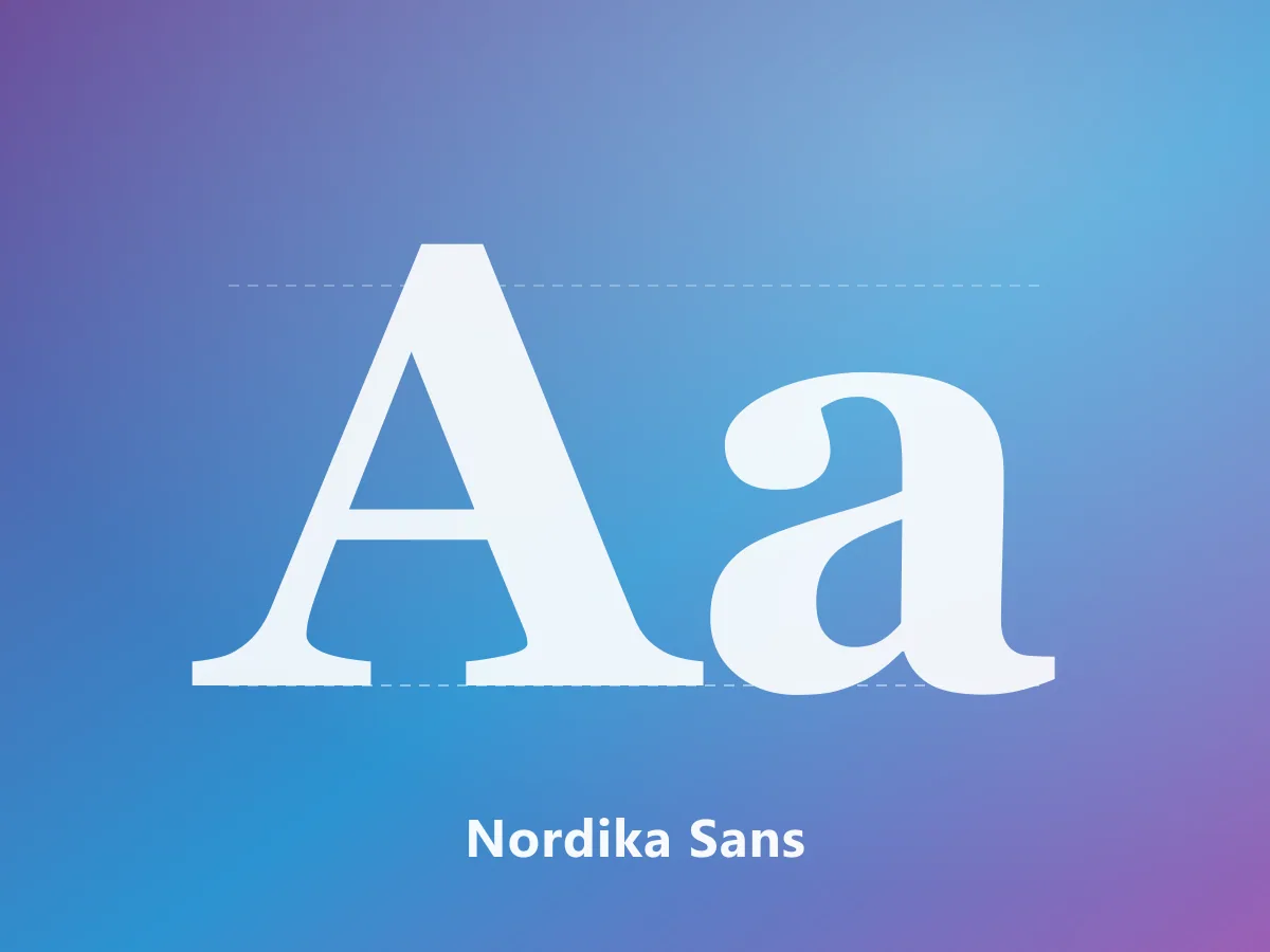
That is exactly why we drew Nordika Sans with a tall x-height: it had to stay crisp in interface text between 12 and 14 points.
Look at the apertures
The aperture is how open letters like c, s and e are. Closed apertures make letters look alike at small sizes, and e starts to read as c. Faces with open apertures are safer both on screen and in print.
Pair fonts by contrast, not similarity
Good pairings are built on contrast. Two faces that are almost alike read as a mistake when placed next to each other. The reliable formula is:
- Pick a face with strong character for headlines
- Pick a neutral, highly legible face for body text
- Make sure their skeletons differ while their x-heights stay close
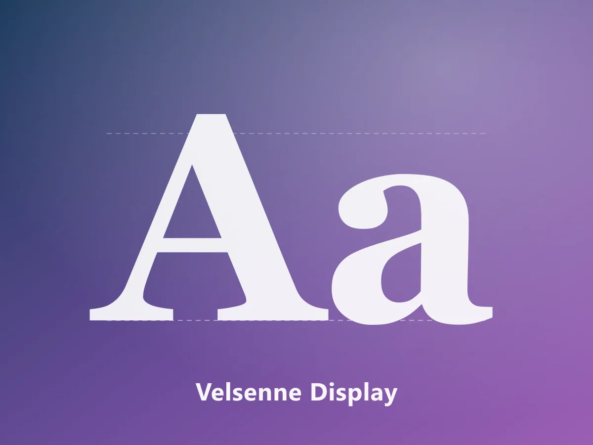
A high-contrast serif such as Velsenne Display paired with a neutral sans like Nordika Sans is the classic version of that balance.
More weights means more flexibility
A single-weight font makes hierarchy hard to build. An interface or editorial design needs at least four weights: Regular, Medium, SemiBold and Bold. If the family also includes italics, you can handle quotes and emphasis without bringing in another typeface.
Test the languages you actually publish in
If you work in Turkish, five characters matter most: ı, İ, ğ, ş, ç. Many international families include them as auto-generated glyphs and the result looks wrong; the dotless i is often just an i with the dot removed, leaving the proportions off.
Before buying, type a sentence that uses them into the specimen tester and look at the spacing against the surrounding letters.
The licence matters as much as the drawing
When you buy a font you are buying the right to use a piece of software. Licences usually split into:
- Desktop: installing on a machine and using it in design software
- Web: embedding on a website with @font-face
- App: embedding inside a mobile or desktop application
- Broadcast / Logo: use in video and brand identity
Buying one tier does not cover the others. Deciding up front which ones your project needs is cheaper than upgrading a licence later.
What the file formats mean
- OTF / TTF: standard desktop formats
- WOFF2: compressed web format with the smallest file size
- Variable font: a modern format carrying every weight in one file
On the web, shipping WOFF2 only makes a measurable difference to page speed. A variable font gives you every weight from a single file, which also cuts the number of requests.
A short checklist
Before choosing, answer these:
- Where will the font be used?
- How many weights do I need?
- Are the characters for my languages properly drawn?
- Does the licence cover everything I plan to do?
- Which file formats are included?
- Have I tested it at small sizes?
If all six answers are clear, the font you picked is probably the right one.
MYDigitalabs typeface families are licensed through MyFonts and ship with extended Latin support, including Turkish, plus WOFF2 files for the web.
Tags
- font selection
- typography
- font licence
- brand identity
- legibility